
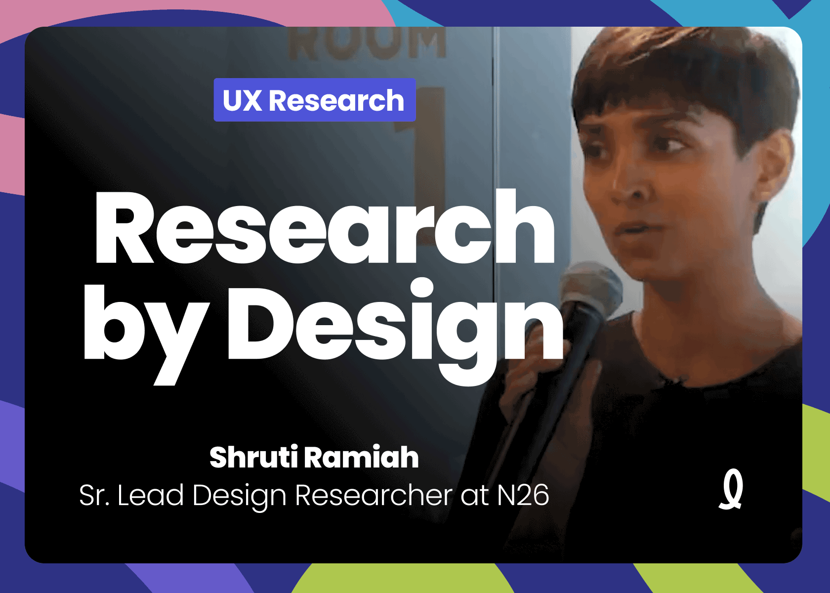
Talk Companion | Design it Wrong: How Designing for Research is Different by Shruti Ramiah
Presented on June 6, 2019 at UXRConf 2019 in Toronto, Canada.
Watch the full talk on YouTube here. Want to listen audio-only? Find this talk on Apple Podcasts here and Spotify here.
Talk Overview ✨
Design can be more than a tool for… design. It can be a fantastic research tool, as well.
If you're a designer doing research, Shruti Ramiah has some tips for you. Leverage your design superpowers to craft research experiences that only you are able to create.
Key Takeaways 🔑
1. Move Beyond Usability Testing as the Default
While usability testing is a reliable and familiar tool, it can become repetitive and limit the depth of insights gained. Senior UX researchers should encourage their teams to explore other research methods that challenge assumptions and expand understanding, particularly in complex or novel design contexts.
2. Embrace Failure as a Learning Opportunity
Research should not just confirm what is already known but should aim to uncover unexpected insights and potential issues. Senior researchers should cultivate a culture where surprising or negative feedback is seen as a valuable opportunity to learn and iterate, rather than a setback.
3. Utilize Creative Research Techniques
Techniques such as “Stop Short” (leaving intentional gaps in prototypes) and “Design It Wrong” (intentionally creating flawed designs) can provoke deeper user insights by challenging their expectations and encouraging more candid feedback. These methods can help uncover underlying assumptions and unmet needs that traditional approaches might miss.
4. Explore User Behavior at the Extremes
Engaging with users who fall outside the typical use cases can reveal new opportunities for innovation and product improvement. By understanding how outliers use or misuse a product, senior UX researchers can identify ways to refine and expand the product’s appeal and functionality.
5. Design as a Catalyst for Research
Research should be seen as a creative process, where design elements are used as stimuli to elicit meaningful responses from users. Senior UX researchers should advocate for an experimental mindset, where design is not just the output but also a key input that drives the research process and helps uncover deeper insights.
Transcript, Per ChatGPT 🤖
My name is Shruti Ramiah.
I lead user research at a company called N26. We are an all digital bank, a mobile bank based in Europe at the moment. So we are currently in 24 countries across Europe and the UK, soon to be launching in the US. So if you're in the US, look out for us.
We should be coming out in the next couple of months. And we are a team currently of 6 researchers working in a larger, design team. Similar to Danielle, I also come from design. So I trained as an interaction designer and a and a communication designer, practiced design for a while, but I had the nagging, habit of constantly asking lots of questions, and constantly saying why why why why. Questioning the design brief a lot, which was, I'm sure, really, fun for my design managers.
So at some point, I decided that if I'm gonna be asking all the questions, I should take some responsibility for finding the answers, and switched over to making research my focus, in my practice. So what I'll be sharing today is, my approach to research. And being a designer, I have a designerly approach to research as well. And what I'd like to share with you is how you can bring the same creativity and curiosity and exploration that you apply to your design work also to the research that you do, and how that will together make it a more meaningful part of your design practice. So, when I started in 26 in August last year, it was my first time working at a product company.
I had worked at a number of different organizations in different formats of team structures, but I decided to use my skills as a researcher and do a bunch of listening and observing to try and understand how things work within product companies. I spoke to people at other organizations, what were their challenges, how did they sort of stack up against, the way that research is done in other, types of formats. And I think what I'm sharing now is how design and research looks at a lot of places that focus on building product. So you're usually working in sprints, in an agile methodology, maybe 2 to 3 weeks long. It's probably a methodology, maybe 2 to 3 weeks long.
It's probably a week ahead sorry, a sprint ahead of your development team. You might be delivering a pixel perfect design to your development team so that they can go ahead with implementation. So in a sprint, you're potentially conceptualizing, designing, testing, and building out a piece of the user experience. And then you're doing it again in the next print, and the next print, and the next print. So, you know, I understand.
It's pretty it's pretty packed. And then when you fill that with the rituals you need to be a part of, with making sure that there's a certain quality to the design and the implementation as well, with having an outlook towards the product, where it's heading, thinking about the future, all of that gets to be a lot. A lot to think about. It's a wonder we even managed to make time to test. So I really appreciate that we do.
But I think in these situations, what happens is that we go to what we know. We go to the trusty tools that we know we can rely on, that will give us the results that we expect. And usually, that trusty tool is usability testing. It's predictable. It's reliable.
It fits in really well with our process because it helps us to validate and confirm the design that we're gonna ship very quickly, very soon. So it just gives us a lot more confidence before we push this design out. We feel a bit more secure, and I completely understand how that's a good, check to have before you go go with building things and sending them out to lots of humans. But it can get a bit cookie cutter if that's what you're only doing. Sometimes I hear this.
So, you know, you've been doing this testing. Maybe it's like the 6th time this part of the product has been evaluated. And you're starting to get kind of lukewarm reactions. You're not really learning all that much, but at least you got some feedback. And this feeling that some feedback is better than feed no feedback at all can be kind of pervasive.
The problem for me is really when there's bad news. So I hear, designers say how when stuff goes wrong in usability testing, it feels like a complete meltdown. Because you've got a lot of, conflicting feedback. It's not what you expected, and you're gonna do a major redesign. Feedback.
It's not what you expected, and you're gonna do a major redesign. But that means time. And that means holding up your design team, your your development team. That can feel like a lot of responsibility to rest on your shoulders. And that for me is unfortunate.
Because if the feedback from users starts to feel like failure, then we're really not seeking a moment of learning anymore. If feedback feels negative, it's not really accomplishing the purpose of research. So think about it like this. If you do user testing, or if you do user research, and every time you get, confirmatory feedback, everything is good, people understand how it works, there's nothing major wrong with it. You've only confirmed the existing hypotheses you had.
You've confirmed what you know, but you haven't expanded your understanding. It's only when you hear surprising things or unusual things or things that contradict your current understanding or things where people approach it completely differently or have needs you hadn't addressed so far, that's when you're really learning about users and their needs and their motivations. So a bit of failure is actually a part of user research. I would argue that if you are not failing a little, you're kind of missing out on the purpose of user research. So, what are you missing?
I'm going to use an analogy. Say you are a snack company, and you have decided to invest in designing the best line of matcha cookies. I don't know if matcha cookies exist but it seemed unusual to me. And, you know, you've decided there's an opportunity, market for matcha cookies. Now, let's walk down that path and for the next 10 sprints you design the perfect cookie.
You like find the perfect baking temperature and the perfect amount of flour and butter and matcha to put in there. So that at the end of the process, you have the perfect cookie. If you only did evaluative testing through that process, asking people that the cookie was getting better, great. Now you are an expert at cookies, especially matcha cookies. But you don't know anymore about when people look for a matcha cookie, what are the cultural associations with it, what are the moments when they need 1, what is actually going on, what is that emotional snack, actually feeding?
So you've not really expanded your understanding of the users and their context. You've you've just expanded your understanding of the design. A colleague of mine was reflecting on a similar situation. So they were launching a really big part of the product. It was brand new.
It's it's nerve wracking to build a whole new part of, of your product. And they had sort of fallen into a behavior of testing really, really frequently. At the peak of that, they were testing every week. So every Monday, they planned. Every Tuesday, they recruited.
Every Thursday, they tested. It was a bit nuts. And the way he described it was that he said, I was always just user testing, and I wasn't doing user research, which made me kind of reflect on what that means. I like this definition of user research. It's by Jane Fortensuri.
It's actually in the book that, Christina just mentioned as well. So you can spot it in there if you read the book. So she says design research both inspires imagination and informs intuition through a variety of methods with related intents to expose patterns and rely the rich reality of people's behaviors and experiences, to explore reactions to codes and prototypes, and to shed light on the unknown through intuitive hypothesis and experiment. I like this bit. Inspires imagination and informs intuition.
I would argue that that is the purpose of design research. Design research exists to inform and inspire your intuition as a designer. Design, in its essence, is a projected activity. You have to take what you know today about the present and throw it into the future. You have the understanding of user needs, user motivations, their behaviors today, but you have to build excellent hypotheses about how you might serve them in the future.
So that means you have to make lots and lots of detailed decisions, And design research can help to feed and nurture and develop your gut, your intuition for how to make those decisions. I'm sure many of you are familiar with this model of of design. So discover, define, develop, deliver. And many of us spend a lot of time on informing our intuition and exploring in this space. So during the discover phase, we'll often take a pause.
We'll, maybe do even ethnographic research, go out and do in context in, interviews, spend a lot of time and effort in getting to know the users. But the reality is that we spend how might we build exploration and inspiration throughout the design process, not just at the very start? So I have a few ideas about that, obviously. The first thing I have to suggest to you is that you trust yourself. This may come a bit sideways, but the fact is, if we could test everything and we could validate everything before we ship it out into the world, that would be great.
But if you're gonna make a choice to do something else, you're gonna have to sacrifice some usability testing or some evaluative research. So that means that in some of these moments, you're gonna have to be confident and say, I believe this design works. We don't need to test this. And I know that's scary, and it's weird coming from a researcher. But it's true.
Sometimes you can say that because you are a researcher you're a designer working in, the great design systems using great standards. You have an iterative process. You have great colleagues that give you good feedback. If you're doing all of that, you're well on your way to being able to be confident and say that this bit, you know, we can ship this. It's okay.
We don't need to test it. What that allows you to do is then pause and think about what you need to learn. What are the open spaces in your understanding of the users? What's the gap that you need to fill? Of the users?
What's the gap that you need to fill? What is the ground that you need to expand that you can understand, more about these users and how they're gonna use your product? I'd like to share 4 concrete approaches based on stuff that we do at n 26 as well. I'm also gonna go to town with all the food analogies. So if nothing else, you're gonna get very hungry for lunch.
But hopefully, you'll remember the 4 approaches as well. So the first one is called stop short, or I've called it stop short. Think of a prototype. A prototype is essentially a story, a narrative. You tell people, you know, this happens, then this happens, then this next thing happens, and then, ta da, you have this outcome.
If you were to leave a gap in that story, people will just fill it with what they assume is going to happen. Now if you leave an intentional gap in the story, you can actually use that to uncover what are the assumptions people are gonna make about your product, and what are the expectations they're gonna bring to your product. How do they imagine it will work? And how do they compare it to other experiences they have? What are the references they're gonna use to understand what your product is and how it works?
So here's an example from some work we've done at n26. So we have a product called spaces. It helps you budget and save. It's basically these sections over here. You can easily create a space, move money in there, and then that helps you either plan for a vacation or save up for something, important to you.
And we were thinking about what does it mean to potentially share a space? How do people think about that? And what we did in testing was in the, in the early days, we simply showed screens like this. So no flows, just quick screens. So in the first one, you can see there are a couple of icons thrown onto the space that sort of indicate sharing.
And in the second one, you see that there's some profile pictures. And we ask people to look at these, so people who understand our products, their existing users, and they use spaces and say, what do you think this stuff is? What do you think this means? What would you do with this? Oh, you think it means sharing?
What would you use, you know, would you who would you share this with? What would you want to share it for? What would be the purpose of that shared space? The second the last one over there, that screen is from the settings. And anyone who is familiar with the the Spaces product would know that bottom section of members was completely new.
It was just sort of like bunged on to the existing screen. And And we asked people to talk through what would happen when they press new contributor. So they had to just talk us through what the flow would be when you say new contributor. What happens? How does it go?
An interesting learning we had from doing this research was that people use the reference of WhatsApp and, actually messaging platforms to understand how groups would work. How invitation would work, how rights would work, how people imagine that you could bring people in, or when things go wrong, push people out of a space. And that's helped us to really understand where the bar is in terms of the easiness and the the simplicity of sharing that we need to create, even though this is a financial product. So one thing, Daniel made a good point, during our review sessions was to remind me to say that this isn't the only way to stop short. There are many ways to stop short.
Prototypes are a simple way because we always use them. But one of the ways, that I'm fond of but has really fallen out of favor is using wireframes and sketches. Nobody likes wireframes anymore. And I you do. Yay.
1 person. I think that's because it's become so easy to design, you know, at full resolution. That's almost like why should we do wireframes? It makes no sense. It's a very good reason.
The reason is that people are kind and polite. So when you show them a design that looks so complete, like this looks like it could be in the app right now. When you show them this complete design, they don't feel permission to critique it on a on a fundamental level. They're like, okay. The concept's set.
Let's just tell them the stuff they can change now to fix it and make it better. If you showed it to them as a sketch or if you showed it to them as a wireframe, you're saying to them, hey, this is all movable. This is not done. You can tell me whatever you think. And then people are a lot more comfortable giving you very fundamental feedback.
And that's good because it derisks everything that you're doing. So use wireframes and and and sketches. I know that it's hard for designers, but try it. It's not it's not giving them an incomplete design. It's intentionally using a different tool to get different feedback.
The second approach I'd like to share I've called layer the cake. So with, design, there's so much going on at one time. Right? There's your business concept. There's the the product concept.
Then you've got information architecture, UI navigation. You've got visual design. You've got content, copy, imagery. You've got micro interactions. It's just this giant stack of lots of things going on at the same time to make an amazing experience.
The thing is when something's not working, it's hard to unpack in which layer it's not working. And if you test it collapsed, what happens is that either, you know, hopefully, you found the problem, but you don't know it's the only problem. And even if you found the problem and fixed it, it may not be the best fix because you're doing everything collapsed together. So when you're trying to diagnose a problem and identify the right solution, it's good to move to an approach where you unpack these layers and separate them out. And for that, you need to go for a hypothesis based approach.
So at n 26, we have 3 tiers of our product. We I'm doing this introduction because probably you don't know us. We have basic and then a mid tier called black and then metal. So we hope that users will start with us in the basic product, which is free. And, you know, upgrade to higher levels as they figure out what our product is and what they need.
But we weren't seeing a lot of upgrades in the app. So the product managers went to the fundamentals, and they were like, maybe this isn't the right thing. Maybe we should adjust the offering. Maybe we should start to, like, adjust some of the the pieces within these tiers. But one of the designers on the team had a hunch.
This is where the upgrade option used to live in the app. So this little section, we call my account. It's where you can sort of handle all the admin behind your, your account and your card. And there was a little call to action that said get more from your account, upgrade your membership. And his hunch was this is just too hidden.
People just don't find it. They don't expect to find it there, and that's why they're not upgrading. So we did a card sorting exercise. Very simple, far away from actually this level. It's on the information architecture level.
Exploring where people think they should find, exploring where people think they should find the upgrade option. And as expected, they did not think it would be in my account. They thought it's something different. It's not about my account. And we knew from the data, so the usage data of our app, that there isn't a lot of visiting the the my account section.
So that was a clear indicator that we need to move things around. So we, had to actually shuffle around and change the whole architecture, and we created a new section called explore. And in the explore section, as you can see, the new upgrades have a lot more visibility, a lot more real estate. It looks much nicer than the previous option. So with that, we're actually seeing an increase in upgrades.
Going back to the point of, like, you might have a problem in many layers. That doesn't mean all the problems are solved, but definitely one of the issues was identified and improved. The 3rd, approach that I'd like to suggest, I've called go to the extremes. So we when we build a design out or ship a certain feature in our product, we have an idea of how we think it will be used. Like, how do people, how will people typically use this feature?
And we talk to the people who lie usually in that typical target user base. But what this approach says is go to the extremes. Talk to the people who do strange things with your product. Talk to the people who are completely misusing it or using it completely differently than what you expected. What that's really good at is actually opening out your mind and now opening out your understanding of your product when it's quite stable.
So when you have something running and you want to explore opportunities. Going back to spaces. So this is what we thought spaces would typically look like for people. So they'd have their primary account, and then they'd have something like a holiday bucket. That's a holiday space that they were saving into.
And then maybe for a rainy day, they're sort of putting money away consistently. Once once we'd launched this service for for a while, we decided to do some interviews with people who were either regular users of n 26, but just not using spaces at all, or people who had, like, 7, 8, 9 spaces, which we're like, what are they doing with these spaces? You know? What's going on over there? It was really interesting because with the people who didn't use spaces, we were able to uncover sort of what's that little tipping point?
What's the feature that might get them to use the product? What was missing? What's the last piece that would fit into the use case they were seeking? And with the people that were doing a lot of spaces, we were able to understand different mindsets and different approaches to using this product. And what was interesting with those folks was mostly they were, doing really detailed budgeting.
So they had everything broken out into different little spaces. One of the features we built, based on the feedback that we got, was a lock functionality. So this was from the folks that, weren't using the product so far. So they said people really love our drag and drop money transfer. So even though it's different accounts, you just tap and drag and drop money.
It's really smooth. It's really easy. But for these folks, it was like it's too easy. I move the money and then I move it back. And I can't help myself.
And I'm not saving because it's just too easy for me to push it back into my regular account, you know. I can go back on the promises I've made to myself. Can you make it harder? Can you add some friction? So we actually added this little lock functionality where you go into the space and you lock it.
You can always move money in money out. So what that means is if you are going to go back on your decision to save, you're gonna have to take an extra moment to unlock that space and say, yes. This is a real reason why I wanna take this money out right now. It's a little feature, but it's interesting how it speaks to a certain use case that's very human. And the final one I want to show you, final approach is design it wrong.
And that's the inspiration for this talk as well. This is where the talk sort of was born. To explain this, as designers, we're kind of passionate about every single piece of our product. We focus on every little detail. We put as much energy into a part of the experience if it's gonna be used once or gonna be used daily.
Like, we love every bit of it. And that's our job. It's not the same for users. There are parts of experiences user experiences where people just don't really have an opinion. They are not, like, loving it or hating it.
It's kind of like, it's fine. It works. They just get used to whatever you offer them. And if you wanted to test that and you just kept showing them your evolving just kept showing them your evolving designs, it would always be kind of like, that's good. That works.
So you don't really get a lot of feedback back for these sections of your app. Like, settings is a great example. Nobody really has a lot of passion for settings. How are you gonna get lots of good feedback on how your settings should be designed? So this is an approach that really helps to create enough friction that people can respond to what you're showing them.
So this is what our current transaction list looks like. This is where you land when you first open the app. It's clean. It's neat. It's kind of, quite minimal.
And we were looking into, what are the information hierarchies as we, you know, add more aspects to our product? What, what should we prioritize? What use cases are important? And much to the chagrin of the designer on the team, we forced him to design a really, really ugly screen. Really ugly, really painful, really sort of saturated and hard on the eyes.
It took a lot of iterations. He really hated this process. It was like pulling teeth. It was like, no. Make it uglier.
Make it uglier. It's not ugly enough. So what we did with this was we actually showed it to users of our current product, and we asked them to clean it up. What would you do to make this right for you? What would you take out?
You just don't need this information. Or which hierarchies are wrong? What's more important to you and is not priority enough in this transaction list? Or what are the use cases? How do you normally parse your transaction list?
Is this working for that or not? And with that, we were actually able to surface much more indicative and informative information than if we had showed them just the next version of the transaction list. So that's 4 approaches. Stop short, which is great when you're trying to understand what are the assumptions and expectations that people come to your product with. Layer the cake so that you split it out, and you can identify exactly where your problem lies.
Go to the extremes. Don't just talk to the typical user. Talk to the people on the edges so that they can show you the opportunities and the possibilities for your product. And design it wrong. Sometimes it's better to just do a really bad job so people can have enough friction to give you feedback on the things they don't have strong opinions about.
Going back to the quote from Jane, I'd like to highlight a different section. So shed light on the unknown through iterative hypothesis and experiment. I really like this idea of research as an experiment. So you're creating a situation, you're sort of choreographing a situation, and you put you insert people into the mix, and you see what happens. You see what emerges.
That's kind of a way that I imagine, a research test or any kind of research. And when you think about the fact that people are usually not that great about really communicating what they think and how they feel, that what they do and what they say can be really different things, it starts to make more sense that we need to really create these situations for them to give us the right feedback. And the question becomes, what stimulus will draw out the most useful response from people? And when you think of it this way, design becomes the material for research. Design becomes the input, the the catalyst that you put into the experiment to create the right reaction to produce the right response.
With that, I hope I've shown you that each piece of research is a unique question. And that you can really explore and experiment and design how you try and answer that question. And that research really is a creative activity.
Thank you.
Thanks for reading! You can find more about our upcoming events and content by signing up to our mailing list, following us on LinkedIn, or subscribing to our YouTube channel.
See you soon! 👋